Maps#
[2]:
import cartopy.crs as ccrs
import numpy as np
import xarray as xr
from matplotlib import pyplot as plt
import figanos.matplotlib as fg
fg.utils.set_mpl_style("ouranos")
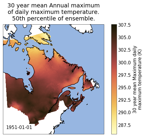
# load dataset
url = "https://pavics.ouranos.ca/twitcher/ows/proxy/thredds/dodsC/birdhouse/disk2/cccs_portal/indices/Final/BCCAQv2_CMIP6/tx_max/YS/ssp585/ensemble_percentiles/tx_max_ann_BCCAQ2v2+ANUSPLIN300_historical+ssp585_1950-2100_30ymean_percentiles.nc"
opened = xr.open_dataset(url, decode_timedelta=False, engine="netcdf4")
ds_space = opened[["tx_max_p50"]].isel(time=0).sel(lat=slice(40, 65), lon=slice(-90, -55))
Gridded Data on Maps#
The gridmap function plots gridded data onto maps built using Cartopy along with xarray plotting functions.
Visit the timeseries notebook to learn the basic functions of figanos. The main arguments of the timeseries() functions are also found in gridmap(), but new ones are introduced to handle map projections and colormap/colorbar options.
By default, the Lambert Conformal conic projection is used for the basemaps. The projection can be changed using the projection argument. The available projections can be found here. The transform argument should be used to specify the data coordinate system. If a transform is not provided, figanos will look for dimensions named ‘lat’ and ‘lon’ or ‘rlat’ and ‘rlon’ and return the
ccrs.PlateCaree() or ccrs.RotatedPole() transforms, respectively.
Features can also be added to the map by passing the names of the cartopy pre-defined features in a list via the features argument (case-insensitively). A nested dictionary can also be passed to features in order to apply modifiers to these features, for instance features = {'coastline': {'scale': '50m', 'color':'grey'}}.
The gridmap() function only accepts one object in its data argument, inside a dictionary or not. Datasets are accepted, but only their first variable will be plotted.
[3]:
fg.gridmap(
    ds_space,
    features=["coastline", "ocean"],
    frame=True,
    show_time="lower left",
)
[3]:
<GeoAxes: title={'center': '30 year mean Annual maximum\nof daily maximum temperature.\n50th percentile of ensemble.'}, xlabel='lon [degrees_east]', ylabel='lat [degrees_north]'>
/home/docs/checkouts/readthedocs.org/user_builds/figanos/conda/latest/lib/python3.14/site-packages/cartopy/io/__init__.py:242: DownloadWarning: Downloading: https://naturalearth.s3.amazonaws.com/50m_physical/ne_50m_ocean.zip
  warnings.warn(f'Downloading: {url}', DownloadWarning)
/home/docs/checkouts/readthedocs.org/user_builds/figanos/conda/latest/lib/python3.14/site-packages/cartopy/io/__init__.py:242: DownloadWarning: Downloading: https://naturalearth.s3.amazonaws.com/50m_physical/ne_50m_coastline.zip
  warnings.warn(f'Downloading: {url}', DownloadWarning)
Colormaps and colorbars#
The colormap used to display the plots with gridmap() is directly dependent on three arguments:
cmapaccepts colormap objects or strings. Strings passed can either be names of built-in matplotlib colormaps or names of the IPCC-prescribed colormaps that were registered to matplotlib upon importing figanos (see cell below). The colormaps are built from RGB data found in the IPCC-WG1 GitHub repository. Any colormap specified as a string can be reversed by adding ‘_r’ to the end of the string.divergentdictates whether the colormap will be sequential or divergent. If a number (integer or float) is provided, it becomes the center of the colormap. The default central value is 0.levels=Nwill create a discrete colormap of N levels. Otherwise, the colormap will be continuous.
By default, if cmap=None, figanos will look for certain variable names in the attributes of the DataArray (da.name and da.history, in this order) and return a colormap corresponding to the ‘group’ of this variable, following the IPCC visual style guide’s scheme (see page 11). The groups are displayed in the table below.
Variable Group |
Matching strings |
|---|---|
Temperature (temp) |
tas, tasmin, tasmax, tdps, tg, tn, tx |
Precipitation (prec) |
pr, prc, hurs, huss, rain,precip, precipitation, humidity, evapotranspiration |
Wind (wind) |
sfcWind, ua, uas, vas |
Cryosphere (cryo) |
snw, snd, prsn, siconc, ice |
Note: The strings shown above will not be recognized as variables if they are part of a longer word, for example, ‘tas’ in ‘fantastic’.
When none of the variables names match a group, or when multiple matches are found, the function resorts to the ‘Batlow’ colormap.
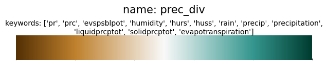
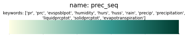
[5]:
import json
from pathlib import Path

import matplotlib

from figanos import data


with data().joinpath("ipcc_colors").joinpath("variable_groups.json").open(encoding="utf-8") as f:
    var_dict = json.load(f)

for f in sorted(data().joinpath("ipcc_colors/continuous_colormaps_rgb_0-255").glob("*")):
    cmap_name = Path(f).name.replace(".txt", "")
    fig = plt.figure()
    ax = fig.add_axes([0.05, 0.80, 0.9, 0.1])
    cb = matplotlib.colorbar.ColorbarBase(ax, orientation="horizontal", cmap=cmap_name)
    cb.outline.set_visible(False)
    cb.ax.set_xticklabels([])
    split = cmap_name.split("_")
    var = split[0] + (split[2] if len(split) == 3 else "")
    kw = [k for k, v in var_dict.items() if v == var]
    # plt.title(f"name: {name} \n keywords: {kw}", wrap=True)
    plt.figtext(
        0.5,
        0.95 + (0.04 * int(len(kw) / 10)),
        f"name: {cmap_name}",
        fontsize=15,
        ha="center",
    )
    plt.figtext(0.5, 0.91, f"keywords: {kw}", fontsize=10, ha="center", wrap=True)


[6]:
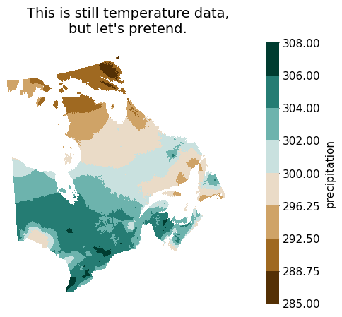
# Change the name of our DataArray for one that includes 'pr' (precipitation) - this is still the same temperature data
da_pr = ds_space.tx_max_p50.copy()
da_pr.name = "pr_max_p50"

# Create a diverging colormap with 8 levels, centered at 300
ax = fg.gridmap(
    da_pr,
    divergent=300,
    levels=8,
    plot_kw={"cbar_kwargs": {"label": "precipitation"}},
)
ax.set_title("This is still temperature data,\nbut let's pretend.")
[6]:
Text(0.5, 1.0, "This is still temperature data,\nbut let's pretend.")
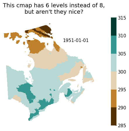
Note: Using the levels argument will result in a colormap that is split evenly across the span of the data, without consideration for how ‘nice’ the intervals are (i.e. the boundaries of the different colors will often fall on numbers with some decimals, that might be totally significant to an audience). To obtain ‘nice’ intervals, it is possible to use the levels argument in plot_kw. This might however, and often, result in the number of levels not being exactly the one that is
specified. Using both arguments is not recommended.
[7]:
# Create the same map, with 'nice' levels.
ax = fg.gridmap(
    da_pr,
    divergent=300,
    plot_kw={"levels": 8, "cbar_kwargs": {"label": None}},
    show_time=(0.85, 0.8),
)
ax.set_title("This cmap has 6 levels instead of 8,\nbut aren't they nice?")
[7]:
Text(0.5, 1.0, "This cmap has 6 levels instead of 8,\nbut aren't they nice?")
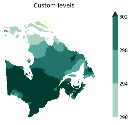
It is also possible to specify your own levels by passing a list to `plot_kw[‘levels’].
[8]:
ax = fg.plot.gridmap(
    da_pr,
    plot_kw={"levels": [290, 294, 298, 302], "cbar_kwargs": {"label": None}},
)
ax.set_title("Custom levels")
fg.utils.plot_logo(ax, loc=(0, 0.85), **{"zoom": 0.08})
/home/docs/checkouts/readthedocs.org/user_builds/figanos/conda/latest/lib/python3.14/site-packages/figanos/_logo.py:127: UserWarning: No logo configuration file found. Creating one at /home/docs/.config/figanos/logos/logo_mapping.yaml.
  self._setup()
/home/docs/checkouts/readthedocs.org/user_builds/figanos/conda/latest/lib/python3.14/site-packages/figanos/matplotlib/utils.py:599: UserWarning: Setting default logo to /home/docs/checkouts/readthedocs.org/user_builds/figanos/conda/latest/lib/python3.14/site-packages/figanos/data/figanos_logo.png
  logos = Logos()
[8]:
<GeoAxes: title={'center': 'Custom levels'}, xlabel='lon [degrees_east]', ylabel='lat [degrees_north]'>
[9]:
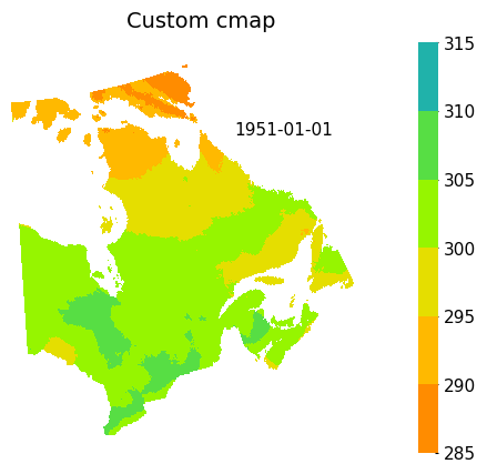
# Create a custom colour map (refer to https://matplotlib.org/stable/tutorials/colors/colormap-manipulation.html#directly-creating-a-segmented-colormap-from-a-list)
from matplotlib.colors import LinearSegmentedColormap


custom_colors = ["darkorange", "gold", "lawngreen", "lightseagreen"]
custom_cmap = LinearSegmentedColormap.from_list("mycmap", custom_colors)
ax = fg.gridmap(
    da_pr,
    divergent=300,
    cmap=custom_cmap,
    plot_kw={"levels": 8, "cbar_kwargs": {"label": None}},
    show_time=(0.85, 0.8),
)
ax.set_title("Custom cmap")
[9]:
Text(0.5, 1.0, 'Custom cmap')
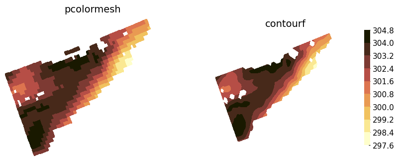
pcolormesh vs contourf#
By default, xarray plots two-dimensional DataArrays using the matplotlib pcolormesh function (see xarray.plot.pcolormesh). The contourf argument in gridmap allows the user to use xarray.plot.contourf function instead. This also implies the key-value pairs passed in plot_kw are passed
to these functions.
At large scales, both of these functions create practically equivalent plots. However, their inner workings are inherently different, and these different ways of plotting data become apparent at small scales.
When using contourf, passing a value in levels is equivalent to passing it in plot_kw['levels'], meaning the number of levels on the plot might not be exactly the specified value.
[10]:
zoomed = ds_space["tx_max_p50"].sel(lat=slice(44, 46), lon=slice(-65, -60))

fig, axs = plt.subplots(1, 2, figsize=(10, 6), subplot_kw={"projection": ccrs.LambertConformal()})
fg.gridmap(
    ax=axs[0],
    data=zoomed,
    contourf=False,
    plot_kw={"levels": 10, "add_colorbar": False},
)
axs[0].set_title("pcolormesh")
fg.gridmap(
    ax=axs[1],
    data=zoomed,
    contourf=True,
    plot_kw={"levels": 10, "cbar_kwargs": {"shrink": 0.5, "label": None}},
)
axs[1].set_title("contourf")
[10]:
Text(0.5, 1.0, 'contourf')
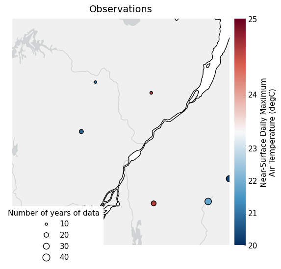
Station Data on Maps#
Data that is georeferenced by coordinates (e.g. latitude and longitude) but is not on a grid can be plotted using the scattermap function. This function is practically identical to gridmap(), but introduces some new arguments (see examples below). The function essentially builds a basemap using cartopy and calls plt.scatter() to plot the data.
[11]:
# Create a fictional observational dataset from scratch
names = ["station_" + str(i) for i in np.arange(10)]
lat = 45 + np.random.rand(10) * 3
lon = np.linspace(-76, -70, 10)
tas = 20 + np.random.rand(10) * 7
tas[9] = np.nan
yrs = 10 + 30 * np.random.rand(10)
yrs[0] = np.nan

attrs = {
    "units": "degC",
    "standard_name": "air_temperature",
    "long_name": "Near-Surface Daily Maximum Air Temperature",
}

tas = xr.DataArray(
    data=tas,
    coords={
        "station": names,
        "lat": ("station", lat),
        "lon": ("station", lon),
        "years": ("station", yrs),
    },
    dims=["station"],
    attrs=attrs,
)
tas.name = "tas"
tas = tas.to_dataset()
tas.attrs["description"] = "Observations"

# Set nice features
features = {
    "land": {"color": "#f0f0f0"},
    "rivers": {"edgecolor": "#cfd3d4"},
    "lakes": {"facecolor": "#cfd3d4"},
    "coastline": {"edgecolor": "black"},
}

# Plot
ax = fg.scattermap(
    tas,
    sizes="years",
    size_range=(15, 100),
    divergent=23.5,
    features=features,
    plot_kw={
        "edgecolor": "black",
    },
    fig_kw={"figsize": (9, 6)},
    legend_kw={"loc": "lower left", "title": "Number of years of data"},
)
/tmp/ipykernel_1908/3473899604.py:40: UserWarning: 1 nan values were dropped when plotting the color values
  ax = fg.scattermap(
/tmp/ipykernel_1908/3473899604.py:40: UserWarning: 1 nan values were dropped when setting the point size
  ax = fg.scattermap(
/home/docs/checkouts/readthedocs.org/user_builds/figanos/conda/latest/lib/python3.14/site-packages/cartopy/io/__init__.py:242: DownloadWarning: Downloading: https://naturalearth.s3.amazonaws.com/10m_physical/ne_10m_land.zip
  warnings.warn(f'Downloading: {url}', DownloadWarning)
/home/docs/checkouts/readthedocs.org/user_builds/figanos/conda/latest/lib/python3.14/site-packages/cartopy/io/__init__.py:242: DownloadWarning: Downloading: https://naturalearth.s3.amazonaws.com/10m_physical/ne_10m_rivers_lake_centerlines.zip
  warnings.warn(f'Downloading: {url}', DownloadWarning)
/home/docs/checkouts/readthedocs.org/user_builds/figanos/conda/latest/lib/python3.14/site-packages/cartopy/io/__init__.py:242: DownloadWarning: Downloading: https://naturalearth.s3.amazonaws.com/10m_physical/ne_10m_lakes.zip
  warnings.warn(f'Downloading: {url}', DownloadWarning)
/home/docs/checkouts/readthedocs.org/user_builds/figanos/conda/latest/lib/python3.14/site-packages/cartopy/io/__init__.py:242: DownloadWarning: Downloading: https://naturalearth.s3.amazonaws.com/10m_physical/ne_10m_coastline.zip
  warnings.warn(f'Downloading: {url}', DownloadWarning)
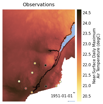
It is possible to plot observations on top of gridded data by calling both gridmap() and scattermap() and fixing the colormap limits (vmin and vmax), like demonstrated below.
[13]:
# defining our limits
vmin = 20
vmax = 35

# plotting the gridded data
ax = fg.gridmap(
    ds_space - 273.15,
    plot_kw={"vmin": vmin, "vmax": vmax, "add_colorbar": False},
    features=["coastline", "ocean"],
    show_time="lower right",
)
ax.set_extent([-76.5, -69, 44.5, 52], crs=ccrs.PlateCarree())  # equivalent to set_xlim and set_ylim for projections

# plotting the observations
fg.scattermap(
    tas,
    ax=ax,
    transform=ccrs.PlateCarree(),
    plot_kw={"vmin": vmin, "vmax": vmax, "edgecolor": "grey"},
)
/tmp/ipykernel_1908/1721594135.py:15: UserWarning: 1 nan values were dropped when plotting the color values
  fg.scattermap(
[13]:
<GeoAxes: title={'center': 'Observations'}, xlabel='lon', ylabel='lat'>
/home/docs/checkouts/readthedocs.org/user_builds/figanos/conda/latest/lib/python3.14/site-packages/cartopy/io/__init__.py:242: DownloadWarning: Downloading: https://naturalearth.s3.amazonaws.com/10m_physical/ne_10m_ocean.zip
  warnings.warn(f'Downloading: {url}', DownloadWarning)
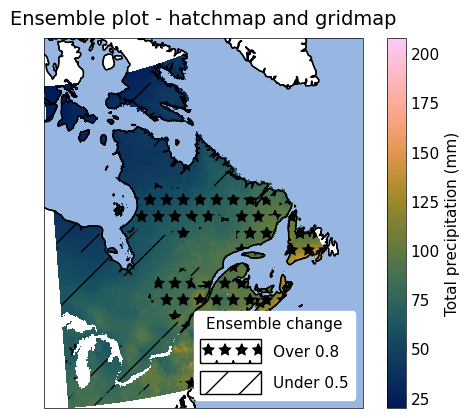
Hatching on Maps#
The hatchmap function plots hatches on top of a map. It is a thin wrap around the plt.contourf() function, with very similar functionality to gridmap() and similar data arguments to timeseries(). It can be overlaid on top of a map created with gridmap() as shown below. hatchmap can also be used with plt.contourf() levels
in plot_kw.
[16]:
from figanos import pitou


# Helper function for loading testing data
p = pitou()

ens_stats = xr.open_dataset(p.fetch("hatchmap-ens_stats.nc")).prcptot_mean
sup_8 = xr.open_dataset(p.fetch("hatchmap-sup_8.nc")).changed
inf_5 = xr.open_dataset(p.fetch("hatchmap-inf_5.nc")).changed

ax = fg.gridmap(ens_stats, features=["coastline", "ocean"], frame=True)

fg.hatchmap(
    {"Over 0.8": sup_8, "Under 0.5": inf_5},
    ax=ax,
    plot_kw={"Over 0.8": {"hatches": "*"}},
    features=["coastline", "ocean"],
    frame=True,
    legend_kw={"title": "Ensemble change"},
)
ax.set_title("Ensemble plot - hatchmap and gridmap")
/home/docs/checkouts/readthedocs.org/user_builds/figanos/conda/latest/lib/python3.14/site-packages/tqdm/auto.py:21: TqdmWarning: IProgress not found. Please update jupyter and ipywidgets. See https://ipywidgets.readthedocs.io/en/stable/user_install.html
  from .autonotebook import tqdm as notebook_tqdm
Downloading file 'hatchmap-ens_stats.nc' from 'https://raw.githubusercontent.com/Ouranosinc/figanos/main/src/figanos/data/test_data/hatchmap-ens_stats.nc' to '/home/docs/.cache/figanos'.
Downloading file 'hatchmap-sup_8.nc' from 'https://raw.githubusercontent.com/Ouranosinc/figanos/main/src/figanos/data/test_data/hatchmap-sup_8.nc' to '/home/docs/.cache/figanos'.
Downloading file 'hatchmap-inf_5.nc' from 'https://raw.githubusercontent.com/Ouranosinc/figanos/main/src/figanos/data/test_data/hatchmap-inf_5.nc' to '/home/docs/.cache/figanos'.
/home/docs/checkouts/readthedocs.org/user_builds/figanos/conda/latest/lib/python3.14/site-packages/figanos/matplotlib/plot.py:692: UserWarning: Colormap warning: More than one variable group found. Use the cmap argument.
  get_var_group(da=plot_data),
/tmp/ipykernel_1908/1738902228.py:13: UserWarning: Hatches argument must be of type 'list'. Wrapping string argument as list.
  fg.hatchmap(
/home/docs/checkouts/readthedocs.org/user_builds/figanos/conda/latest/lib/python3.14/site-packages/cartopy/mpl/geoaxes.py:1631: UserWarning: The following kwargs were not used by contour: 'Over 0.8', 'Under 0.5'
  result = super().contourf(*args, **kwargs)
[16]:
Text(0.5, 1.0, 'Ensemble plot - hatchmap and gridmap')
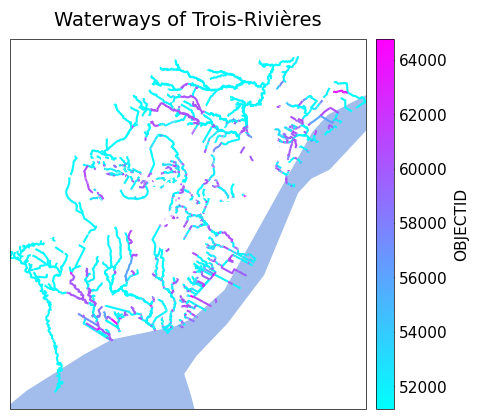
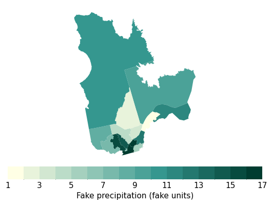
GeoDataFrame on Maps#
The gdfmap function plots geometries contained in a GeoPandas GeoDataFrame on maps. It is a thin wrapper around the GeoDataFrame.plot() method, with very similar functionality to gridmap() and most of the same features.
To use this function, the data to be linked to the colormap has to be included in the GeoDataFrame. Its name (as a string) must be passed to the df_col argument. Like described above, if the cmap argument is None, the function will look for common variable names in the name of this column, and use an appropriate colormap if a match is found.
[18]:
import geopandas as gpd


qc_bound = gpd.read_file(
    "https://pavics.ouranos.ca/geoserver/public/ows?service=WFS&version=1.0.0&request=GetFeature&typeName=public%3Aquebec_admin_boundaries&maxFeatures=50&outputFormat=application%2Fjson",
)
qc_bound["pr"] = qc_bound["RES_CO_REG"].astype(float)  # create fake precipitation data

ax = fg.gdfmap(
    qc_bound,
    "pr",
    levels=16,
    plot_kw={"legend_kwds": {"label": "Fake precipitation (fake units)"}},
)
ERROR 1: PROJ: proj_create_from_database: Open of /home/docs/checkouts/readthedocs.org/user_builds/figanos/conda/latest/share/proj failed
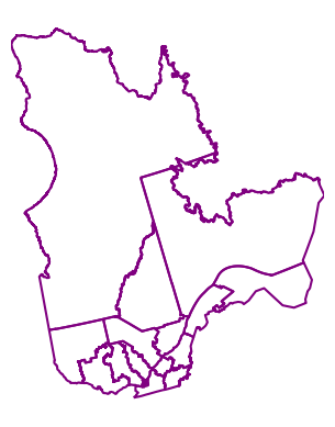
It is also possible to only plot de boundaries with no values.
[20]:
fg.gdfmap(
    qc_bound,
    "boundary",
    plot_kw={"color": "purple"},
)
[20]:
<GeoAxes: >
Projections can be used like in gridmap(), although some of the Cartopy projections might lead to unexpected results due to the interaction between Cartopy and GeoPandas, especially when the whole globe is plotted.
Also note that the colorbar parameters have to be accessed through the legend_kwds argument of GeoDataFrame.plot().
[22]:
# # trick to be able to load the data
import io

import requests


url = "https://www.donneesquebec.ca/recherche/dataset/11a317d0-97a2-4896-85b5-4cb26ccf5dc6/resource/4c6fe152-8c82-4d36-a8e0-9b584b9cde18/download/cours-eau-v3r.json"
# Fetch with browser-like headers
response = requests.get(url, timeout=10, headers={"User-Agent": "Mozilla/5.0 (Windows NT 10.0; Win64; x64) AppleWebKit/537.36"})

r = gpd.read_file(io.BytesIO(response.content))
ax = fg.gdfmap(
    r,
    "OBJECTID",
    cmap="cool",
    # projection=ccrs.Mercator(),
    features={"ocean": {"color": "#a2bdeb"}},
    plot_kw={"legend_kwds": {"orientation": "vertical"}},
    frame=True,
)
ax.set_title("Waterways of Trois-Rivières")
[22]:
Text(0.5, 1.0, 'Waterways of Trois-Rivières')